Solution overview
LeadDNA was a fast-emerging startup in the ERP / enterprise metrics space. With outdated design and usability standards, LeadDNA saw the opportunity inherent in a rebrand and in an application with better usability and more modern design standards.
One of the largest opportunities LeanDNA saw was to streamline the app by removing parts of the app with low usage and focus their energy on areas with high user engagement.
CompanyLeanDNAYear2015Duration6 monthsRoleUser interviews, user testing, visual design, layout, information architecture, quality assurance, prototyping
Before and after


The updated app adapted Google’s Material Design standards to an enterprise application. We were able to drastically update the look and functionality of the LeanDNA app without losing any of the density required by high-volume manufactures with complex workflows.
Organizing the project
The team wanted to achieve two goals with this project. First, they wanted to make complex systems easier to parse by making the app clean, readable and modern. Second, they wanted to focus the app on what was working by eliminating pieces that just weren't being used.
We reached this conclusion through meetings with stakeholders. We also met with a few of our most engaged users. Through these conversations (recorded in part below) we formulated a strategy.
Two user types emerged from our research
We established proto-personas for different types of users in LeanDNA. Broadly, we had day-to-day managers who did data entry and monitored inventory for shortages and overages. Second, we had executives who wanted to use trend reports and charts to give a narrative to other executives and stakeholders.
The work on this project was able to impact both user types.
A key takeaway from user research
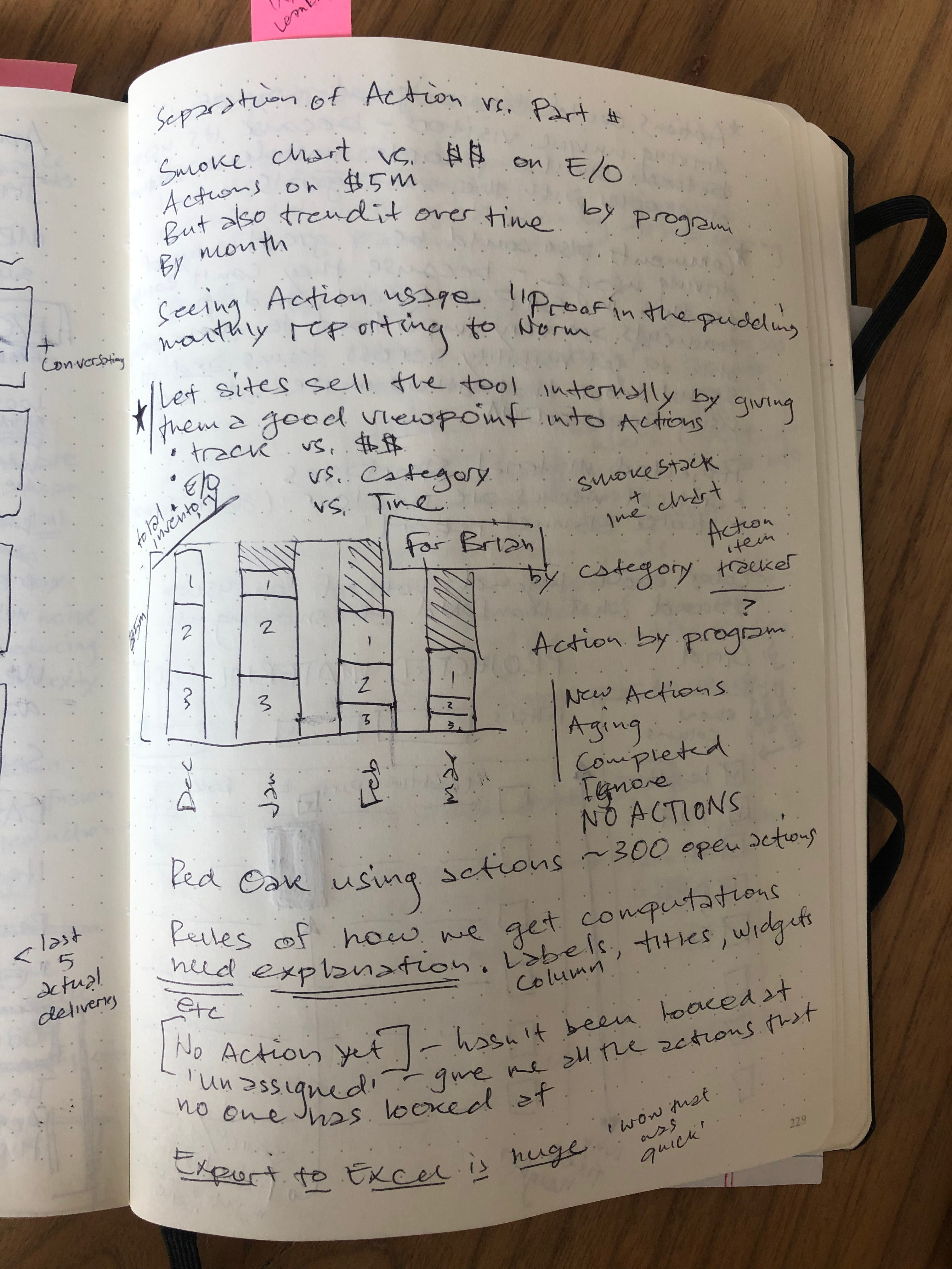
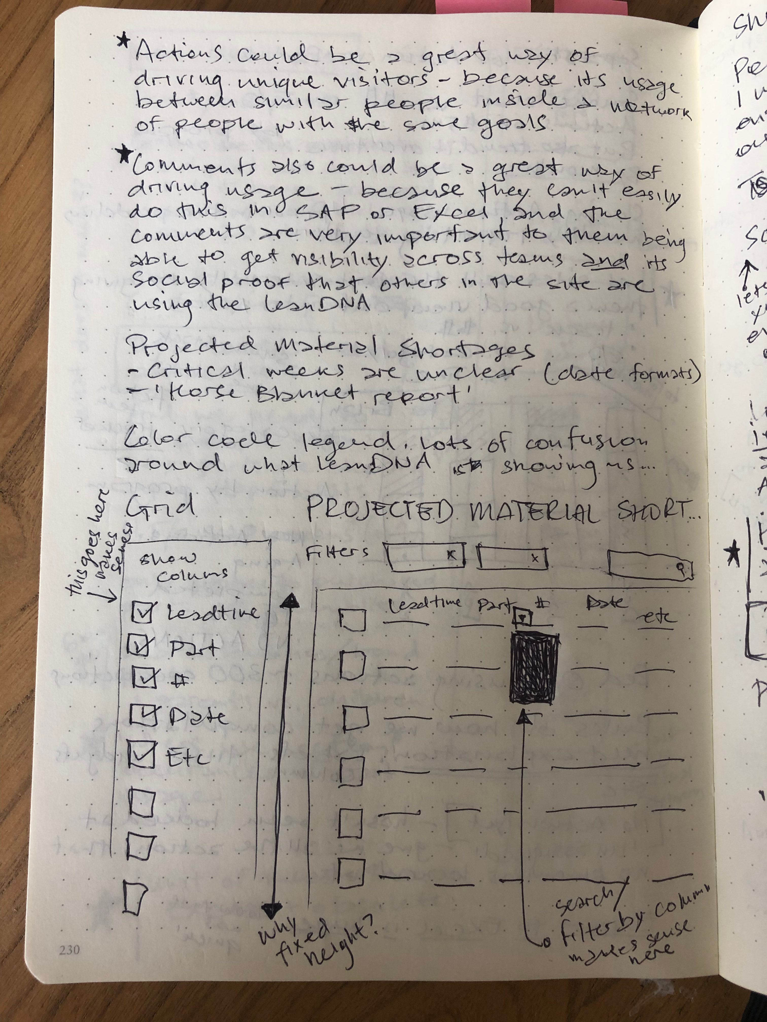
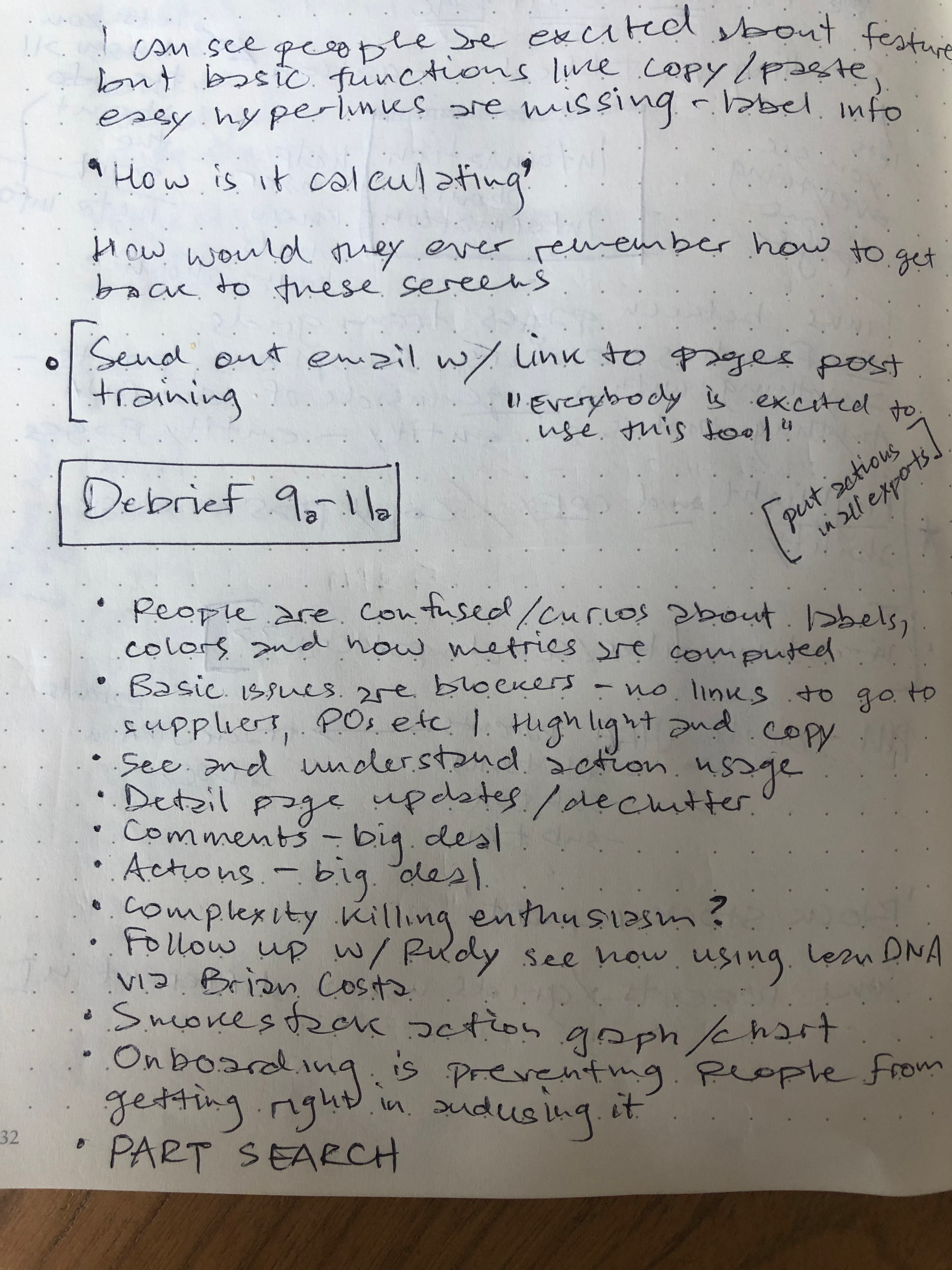
Talking to users (user research) is one of my favorite parts of the job. Insights can be surprising and lead in interesting directions. In this case, users told us that they'd love to have the ability to comment on certain parts of the app. Comments would function as notes to themselves and to anyone else looking at the data.
The ability to comment (and invite others) had the potential to be an exponential driver of user and engagement growth. Creating engaged networks could be the missing piece of LeanDNA's functionality, and could be the key to growth. This hypothesis would need to wait until we could run a proper experiment.
We hadn't realized this insight until we shadowed users and asked them in depth about how they used the system. It's a valuable practice that always yields useful insights.
We started at the core - which parts of the app enjoyed the highest usage?
We started work by looking at the features in the LeanDNA app. We figured that 80% of the value for users was generated by 20% of the features. The app had sprawled, and it was true that some parts of the app weren't being used.
We were able to validate our intuition by stack-ranking pages and looking at page views. Anything that fell below a given # of pageviews was removed. Any part of the app that was below a certain stack rank was also a candidate for being phased out.
What emerged from this exercise was a rubric for making decisions (analytics and page views), as well as a tighter, more focused app. Doing this first allowed us to move confidently into a navigation redesign using Google's Material Design standards.

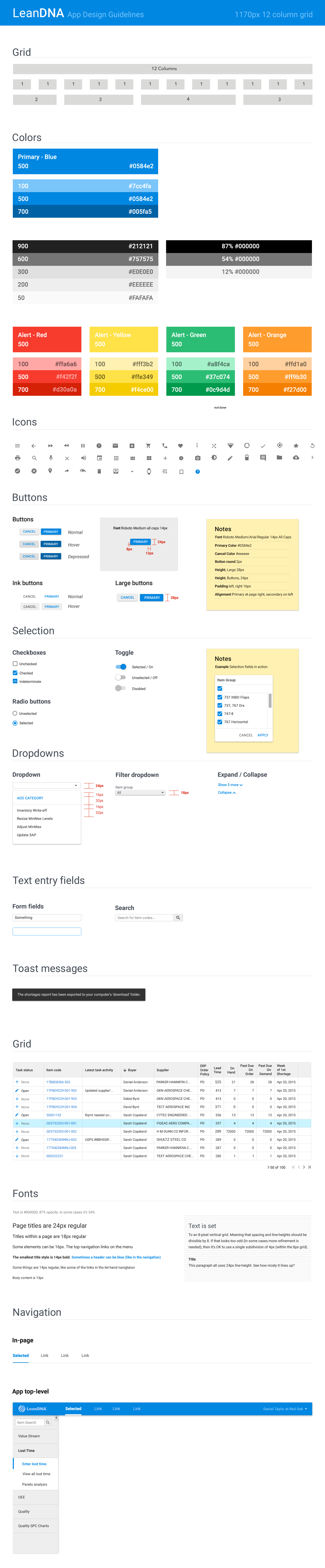
We decided to adapt Google's Material Design standards to our needs.
Users told us they found LeanDNA's navigation and nesting highly organizing. We knew we needed to keep the multi-level nature of the navigation structure. At the time, Material was new and didn't have standards for a 3-level navigation. We decided to innovate a solution.
We used the spreadsheet from the previous exercise to organize a navigation.

Further refining the app
After working on the structure and functionality of the application, we moved on to refining the visual hierarchy, look and feel and presentation of information. As mentioned, we wanted to help executive users of the application. They needed crisp visualizations of their ordering, supply chain, inventory, shortages and more. Google Material didn't have any libraries of data visualizations, so we set about creating our own.


We translated LeanDNA data grids, charts and screens into Google's Material design language
While Materials design language had some accommodation for data grids, most of the native use cases were for simple display and limited actions. We built complexity into Material's strong foundations so that it would work for LeanDNA's use case.


After settling on a visual language, we codified it in a style guide
We knew that in order for the redesign to stick, we needed to create a set of consistent rules. Engineers could refer to this as they built libraries of components. This would also serve as a reference guide for future designers looking to design in LeanDNA.